This content has been automatically translated from Ukrainian.
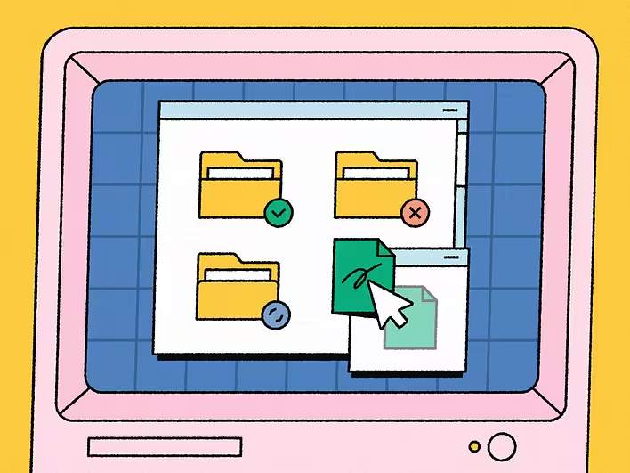
When we drag a file into a folder, close the program with a cross, or click on the trash icon, these actions seem natural. In reality, no document is physically moving across the screen, the program window is not a real window, and deleted photos do not lie in a small trash can inside the computer.
All of this is an element of the graphical interface, that is, a system of images and rules created by designers through which a person interacts with a digital device. It has become so deeply embedded in everyday life that we hardly notice how many conventions we have to understand just to open a file or launch a program.
What is a graphical interface
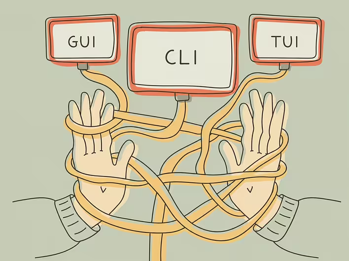
The graphical user interface, or GUI — from the English graphical user interface — is a way of interacting with a computer through visual elements: windows, buttons, menus, icons, switches, lists, and panels.
The user does not need to know what internal command the system is executing. Instead of typing a command to delete a document, they can select the file and click on the trash. To open a program, it is enough to click on its icon. To change the volume — move the slider.
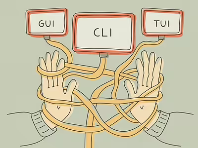
The graphical interface is not the program or operating system itself. It is a visible and manageable layer between the person and digital processes. The same function can be performed through a button, a text command, a voice request, or a gesture — depending on what interface the developers envisioned.
How computers were controlled before the advent of GUI
The first computers did not have familiar screens with desktops and icons. Data and commands could be entered using punch cards, switches, paper tape, or special terminals. Over time, text interfaces became widespread, in which the user communicated with the system through a command line.
To perform an action, it was necessary to correctly type the command and its parameters. An error in a single character could lead to a failure message or an entirely unexpected result. The computer provided almost no hints: a person had to know the available commands, the rules for writing them, and the structure of the file system.
The command line has not disappeared today. It is used by programmers, system administrators, and other specialists, as text commands provide precise control and allow for automating complex sequences of actions. However, for the mass distribution of computers, a management method was needed that did not require prior study of dozens of instructions.
The "Mother of All Demos"
One of the key moments in the history of the modern interface was the presentation held on December 9, 1968, by Douglas Engelbart and his team from the Stanford Research Institute. This event was later called The Mother of All Demos.
In about ninety minutes, the researchers demonstrated technologies that significantly outpaced the conventional ways of working with computers at that time: editing text directly on the screen, hypertext links, collaborative document work, video conferencing, multiple viewing areas, and a device for controlling the pointer — the computer mouse.
Engelbart's system interface did not yet resemble the modern desktop. Its goal was not to draw attractive buttons but to enhance human intellectual capabilities. However, it was here that the principle was demonstrated that became the foundation for future GUIs: the user can work with information directly on the screen by pointing to the required objects.
Xerox Alto: the computer where the future appeared
The next major step was taken at the Xerox PARC research center. The Alto computer, created there in the early 1970s, had a raster display, a keyboard, and a mouse. Its programs used windows, menus, graphical elements, and the "point and click" principle.
On the Alto, text editors operated with a document display that was close to the future printed appearance, graphical programs, and email. The user could select objects with the mouse, cut and paste text fragments, move elements, and see the results of editing directly on the screen.
The Alto did not become a regular home computer: it was an expensive research machine used primarily within Xerox and in certain institutions. However, it combined principles that later became the standard for personal computers.
In 1981, Xerox released the Star office system. It transferred the ideas of laboratory prototypes into a commercial product and consistently used the metaphor of an electronic desktop. Documents, folders, file drawers, incoming and outgoing trays, and printers were placed on the screen. Objects could be moved with the mouse, copied, and opened.
Where the desktop metaphor came from
The desktop helped explain the computer through a familiar office environment. The screen became the surface of the table, files became documents, directories became folders, and the printing device was represented by an image of a printer.
This model did not attempt to accurately reproduce a real office. On a physical table, a folder cannot contain an infinite number of other folders, and a document does not create its exact copy in one second. Designers borrowed only those properties that helped the user anticipate the outcome of an action.
The desktop metaphor partially intersects with skeuomorphism — a principle whereby new objects retain features of familiar physical things. However, these concepts are not entirely identical. A skeuomorphic interface can closely imitate paper, wood, metal, or mechanical buttons, while a modern folder is often just a simple symbolic icon.
Why programs open in windows
A window separates one document, process, or program from others. It can be moved, resized, hidden, maximized to full screen, or closed. This allows the user to see before them not a single undivided space but several independent working areas.
The name "window" aptly describes the principle itself: a person seems to be looking through a rectangular hole at a portion of the content. If the document is larger than the available area, it can be scrolled, revealing other fragments.
Windows also solved the problem of simultaneous work on different tasks. For example, text can be written in one window, checked against a table in another, and messages can be viewed in parallel. Today, this principle seems obvious, but for early computer systems, the ability to freely manage several areas on one screen was an important innovation.
What WIMP means
The classic model of a graphical interface is often described by the acronym WIMP:
Windows — windows,
Icons — icons,
Menus — menus,
Pointer — pointer.
These four components form a system in which the user sees objects, selects them using the pointer, and finds available actions in the menu. It is on such a model that the interface of the first Macintosh and many subsequent personal computers was largely built.
At the same time, the pointer is not necessarily controlled by a mouse. It can be moved by a trackpad, graphics tablet, joystick, or other device. What matters is not the specific tool, but the ability to point to a visible object and perform an action with it.
How icons replaced part of commands
An icon compresses a complex command into a small image. Instead of the text explanation "create a new document," the user sees a sheet with a mark, instead of "print" — a printer, and instead of "search" — a magnifying glass.
A good icon should remain understandable even at a small size. It should differ from neighboring symbols and not require long deciphering. That is why early computer icons were created to be very concise: the low screen resolution did not allow for adding many details.
A significant role in shaping the visual language of Macintosh was played by designer Susan Kare. In 1982–1983, she drew future icons on graph paper, where each square corresponded to one pixel. Her images helped make the computer interface not only understandable but also emotionally friendly.
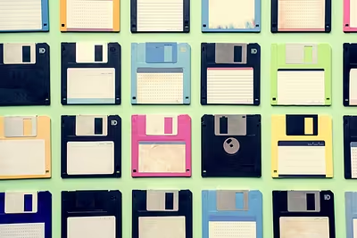
Some of these symbols have long separated from the things they once represented. The most famous example is the floppy disk on the "Save" button. Why this medium has disappeared from computers but remains in interfaces is explained in the article https://qanapa.com/2026/07/30/vid-dyskety-do-khmarnoho-skhovyshcha-iak-zminiuvalysia-nosii-informatsii.
How Apple and Microsoft made GUI mainstream
The ideas of graphical control did not form in one company or at one moment. However, it was the emergence of personal computers with GUIs that helped transfer them from research laboratories to homes and ordinary offices.
In 1983, Apple released Lisa with a graphical desktop, windows, menus, and icons. The computer was expensive and did not become a commercial success, but it significantly influenced the further development of Apple interfaces. In 1984, a more compact Macintosh appeared, aimed at a much wider audience. Mouse control, menus, and working with graphical objects became some of its main features.
Microsoft introduced Windows 1.0 in 1985. The system operated as a graphical environment over MS-DOS and offered menus, mouse support, and program operation in windows. Subsequently, Windows became the dominant platform for personal computers and accustomed a vast number of users to a common language of desktops, panels, menus, and shortcuts.
Companies implemented these principles differently, but gradually a set of expectations formed: a button should respond to a click, a menu should open a list of actions, a window should have an understandable way to close, and a selected object should visually differ from others.
Why the close button has a cross
The cross is not an image of a real object. It is a conventional sign of cancellation, refusal, or termination of an action. In the window interface, it has become associated with the close command and is now perceived almost instinctively.
However, the meaning of the symbol depends on the context. In one application, the cross closes a window, in another — deletes an element, clears a field, or hides a message. Therefore, a graphical interface cannot consist solely of beautiful icons. Their placement, repeatability, and predictable behavior are important.
The user learns not each button separately, but the overall system. If the cross is consistently located in one corner and always closes the active window, the action quickly becomes automatic.
How smartphones changed the graphical interface
The computer GUI was formed around an accurate mouse pointer, keyboard, and relatively large screen. Smartphones changed all three conditions. The user touches elements with their finger, holds the device at a short distance, and often operates it with one hand.
Buttons became larger, menus shorter, and some visible elements were replaced by gestures. To scroll a page, it is as if it is pushed away with a finger. To view the next image, a swipe is made. To zoom in on a map or photo, two fingers are spread apart.
However, the mobile interface did not completely abandon the old language. It retained folders, trash cans, tabs, program icons, and conventional buttons. Even the main screen of a smartphone somewhat continues the metaphor of a working surface, where the user arranges the necessary tools.
Why the graphical interface is not always simpler
The GUI made computers more accessible, but visuality alone does not guarantee clarity. If the screen is cluttered with identical buttons, icons lack labels, and important functions are hidden behind several gestures, the user has to learn the interface through trial and error.
Excessive simplification can also create problems. A flat button sometimes hardly differs from regular text, and a minimalist symbol without explanation may be understandable only to those who have already used similar programs.
Therefore, a good graphical interface does not simply hide technical commands behind pictures. It helps to see available actions, anticipate their outcome, and understand what happened after a click. Windows, folders, and icons are preserved not due to a lack of new ideas, but because they have transformed over decades into a common digital language.