This content has been automatically translated from Ukrainian.
The "Save" button looks like a floppy disk, deleted files go to the trash, emails are marked with an envelope, and the phone application resembles a handset of a device that many people have never used. All these images come from the physical world and continue to live on screens after the objects themselves have changed or almost gone out of use.
This principle is called skeuomorphism. It helps explain new technologies through familiar forms, but at the same time creates a strange situation: digital interfaces retain memory of things that gradually cease to be part of everyday life.
What is skeuomorphism
Skeuomorphism is a design approach where a new object retains the shape, decoration, or interaction principle characteristic of its older physical analog. In a new environment, these elements may no longer serve their original practical function, but they make the object clearer and more familiar.
In digital interfaces, skeuomorphism manifests when an application or its individual elements mimic real things. An electronic notebook may have yellow pages and drawn lines, a calendar may imitate paper sheets, and a music player may have a round volume knob that needs to be turned with a finger.
Skeuomorphism pertains not only to appearance. Sometimes a digital object also replicates the way of interacting with a physical item: a page can be "turned," a switch can be moved, a knob can be rotated, and a card can be pulled from a hypothetical deck. Thus, the interface suggests to the user what can be done with it.
Origin of the term
The word skeuomorph is derived from the ancient Greek words skeuos — "vessel," "tool," or "object" — and morphē — "form." It can be roughly translated as "the form of an object."
The term appeared long before smartphones and graphical interfaces. The earliest recorded use of it is associated with the British physician, anthropologist, and researcher Henry Cole March. In 1889, he used the term skeuomorph to describe decorative elements that retained traces of the construction of older products.
For example, a craftsman might create a clay vessel but add protrusions resembling metal rivets. For the clay vessel, they were unnecessary, as it was not assembled from separate metal parts. However, the decorative "rivets" helped the new product resemble a familiar and possibly more valuable metal object.
Thus, initially, skeuomorphism described not digital design but the transfer of form from one material or method of production to another. Only much later did the term begin to be widely applied to computer interfaces.
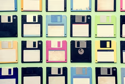
Floppy disk as the "Save" button
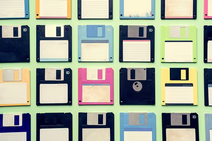
The floppy disk icon is one of the most well-known examples of digital skeuomorphism. During the mass spread of personal computers, floppy disks were indeed used for saving and transferring files. Therefore, its image next to the "Save" command was not decorative but literally described the action.
Later, floppy disks gave way to CDs, flash drives, hard drives, SSDs, and cloud storage. However, the familiar square remained. It no longer indicates which specific medium the file will be saved to, but simply signifies the saving of changes made.
This is a telling case where the image outlived the object. Some modern users have never inserted a floppy disk into a drive but can unmistakably recognize the corresponding button in the program. The real object has transformed into a conventional sign.
Folder for digital files
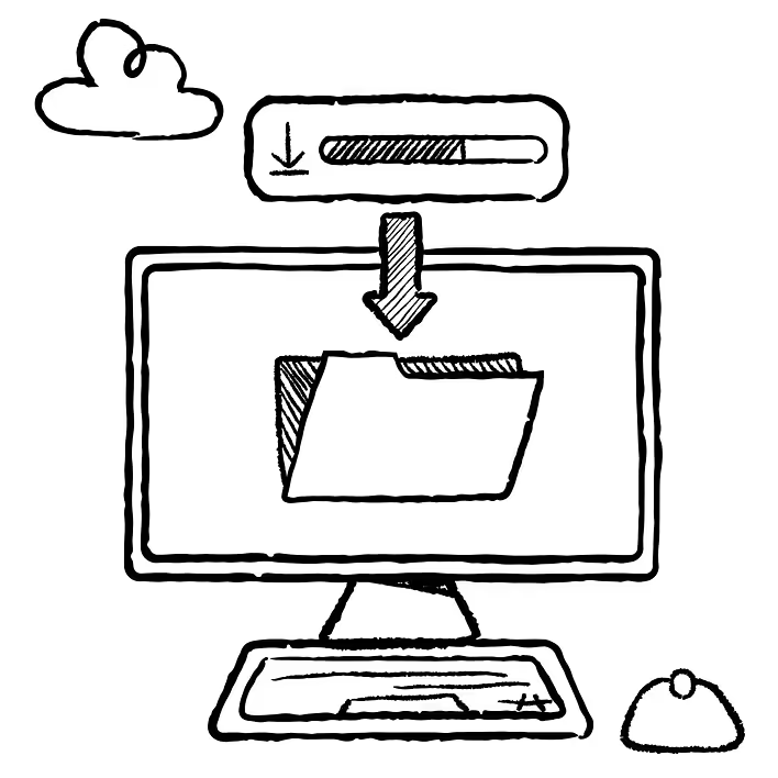
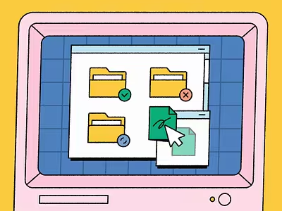
Directories in operating systems are called folders and are represented by an icon of a cardboard office folder. This model replicates the organization of paper documents: individual sheets are placed in folders, folders are stored in cabinets, and titles are written on spines or tabs.
Digital files do not lie inside small yellow covers, but this metaphor made the structure of the computer understandable to people accustomed to working with paper archives. A folder can be opened, named, moved, nested within another folder, or deleted.
Over time, this system has become so familiar that it is no longer perceived as a mimicry of the real world. Even the color of the folder often remains yellow or beige, although there is no technical reason for this.
Trash for deleted files
A computer is not obliged to show the place where deleted documents go. It could simply mark them as temporarily removed. However, the image of a trash can makes the action obvious: an unwanted object can be thrown away, and as long as the trash can is not emptied — retrieved back.
Skeuomorphism works here not only through the image but also through the logic of behavior. The trash can can be empty or full, files can be dragged into it, it can be emptied, and an accidentally deleted document can be restored.
At the same time, the digital metaphor does not fully correspond to reality. Paper thrown into a physical trash can does not return to the desktop with a single click. The digital trash can does not literally copy the real one but borrows only the understandable principle of temporarily separating unwanted items.
Envelope as a symbol of email
An email does not require paper, a stamp, or an envelope. However, mail applications still use the image of an envelope to denote messages, incoming mail, and the "Send" command.
From physical correspondence, digital mail inherited an entire system of words: address, mailbox, inbox, sent, draft, attachment. In reality, a file is not "attached" to an envelope, and an electronic mailbox does not have physical walls. These names create an understandable model, thanks to which the new technology seems a continuation of the familiar.
The envelope has become such a universal sign of a message that it can even be used in services that hardly resemble traditional mail.
Telephone handset
The call button is usually marked by a curved telephone handset. This shape comes from landline devices, where the microphone and speaker were connected by one massive piece.
A modern smartphone does not have a separate handset that needs to be lifted from the body. However, the old silhouette continues to mean "call," and its inverted or tilted version means "end the call."
This example shows how a skeuomorphic sign can lose its obvious connection to the object but retain its meaning due to tradition. For younger users, the curved tube is no longer necessarily an image of a specific device. It is perceived as a separate symbol of a voice call.
Camera and shutter sound
Camera applications often denote themselves with a lens or silhouette of a classic camera. Even when a smartphone has several tiny camera modules and a completely different design, its digital interface mimics traditional photographic equipment.
The round shutter button resembles a mechanical camera button, the screen serves as a viewfinder, and a click sound may occur when taking a picture. In a smartphone, this sound is not always caused by a real mechanical action: it is added so that the user understands that a photo has been taken.
Here, skeuomorphism works on several levels. The appearance explains the purpose of the application, the button replicates a familiar way of taking pictures, and the sound provides confirmation of the action performed.
Paper calendar and notebook
Early digital calendars and note-taking applications often tried to look like real desktop items. They had yellowish "paper," lines, bent corners, metal rings, leather covers, and even decorative stitches.
This style was particularly noticeable in early versions of Apple mobile applications. Interfaces mimicked notebooks, bookshelves, gaming tables, and other physical objects. This approach helped people who were just getting acquainted with touch screens: the digital calendar looked like a calendar, and the notebook looked like a sheet for notes.
Over time, the excessive amount of leather, wood, paper, and decorative details began to be criticized. Such elements took up space, overloaded the screen, and forced the digital product to adhere to the limitations of the object it imitated. In 2013, Apple introduced a completely redesigned iOS 7 interface with simpler shapes, functional layers, and significantly less realistic decoration.
Switches, sliders, and knobs
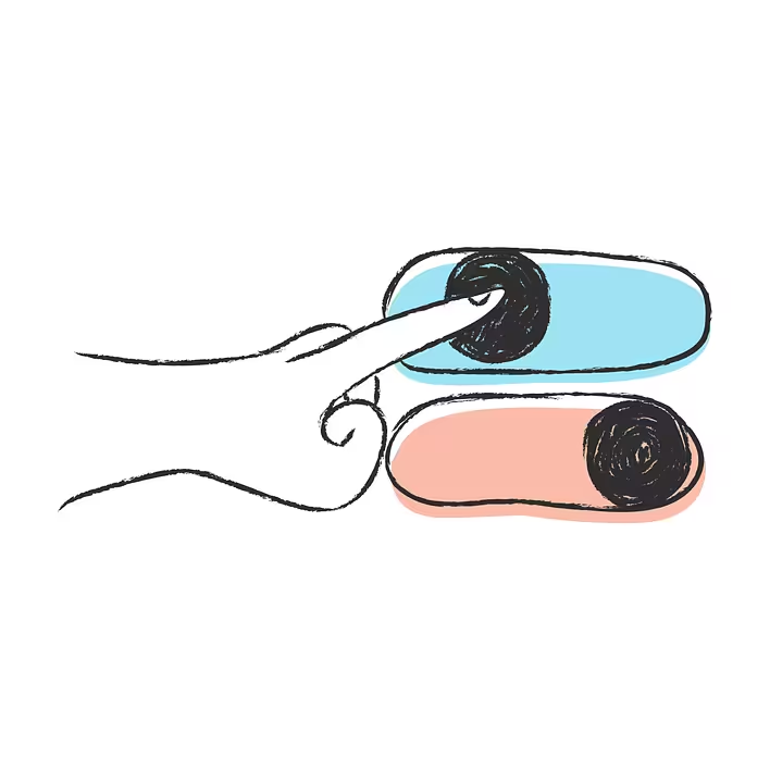
A digital switch often looks like a small movable key with two positions. A volume slider resembles a control on audio equipment, and round knobs in music applications imitate elements of amplifiers, synthesizers, and studio consoles.
On a touchscreen, there is no mechanical necessity to create a protrusion, groove, or shadow. However, these details signal that the element can be moved, pressed, or turned. They create a sense of physical control.
That is why even minimalist interfaces have not completely abandoned skeuomorphism. Buttons may be flat, but they change appearance after being pressed. Cards cast shadows, switches move between two states, and vibrations imitate the response of a real mechanism.
Skeuomorphism and visual metaphor are not quite the same
In a broad sense, a floppy disk, envelope, folder, and telephone handset are often called examples of skeuomorphism. However, there is a difference between realistic skeuomorphic design and a simple icon.
A detailed drawing of a notebook with pages, a leather cover, and a flipping effect is an obvious skeuomorphism. A simple monochrome notebook icon is closer to a visual metaphor: it refers to a real object but does not attempt to fully replicate its material and behavior.
The boundary between these concepts is blurry. However, the main principle remains the same: the digital world uses the experience of the physical so that the user does not have to learn each action from scratch.
Why skeuomorphism has not disappeared
After the spread of flat design, a significant portion of decorative textures, three-dimensional frames, leather panels, and drawn wooden shelves disappeared from interfaces. However, the principle of mimicking real objects continues to work.
The reason is simple: an abstract sign needs to be learned first, while a familiar shape often explains itself. A shadow indicates that a card is positioned above the background. A depression hints that a button can be pressed. The movement of a slider demonstrates a change in value, and vibration creates a sense of physical response.
Modern skeuomorphism has become more restrained. It less frequently tries to turn the entire screen into a wooden table or leather notebook but continues to use familiar shapes, movements, and reactions. As a result, old objects remain part of the digital language even when their original purpose is forgotten.